Diets Don't Work
Logo and website design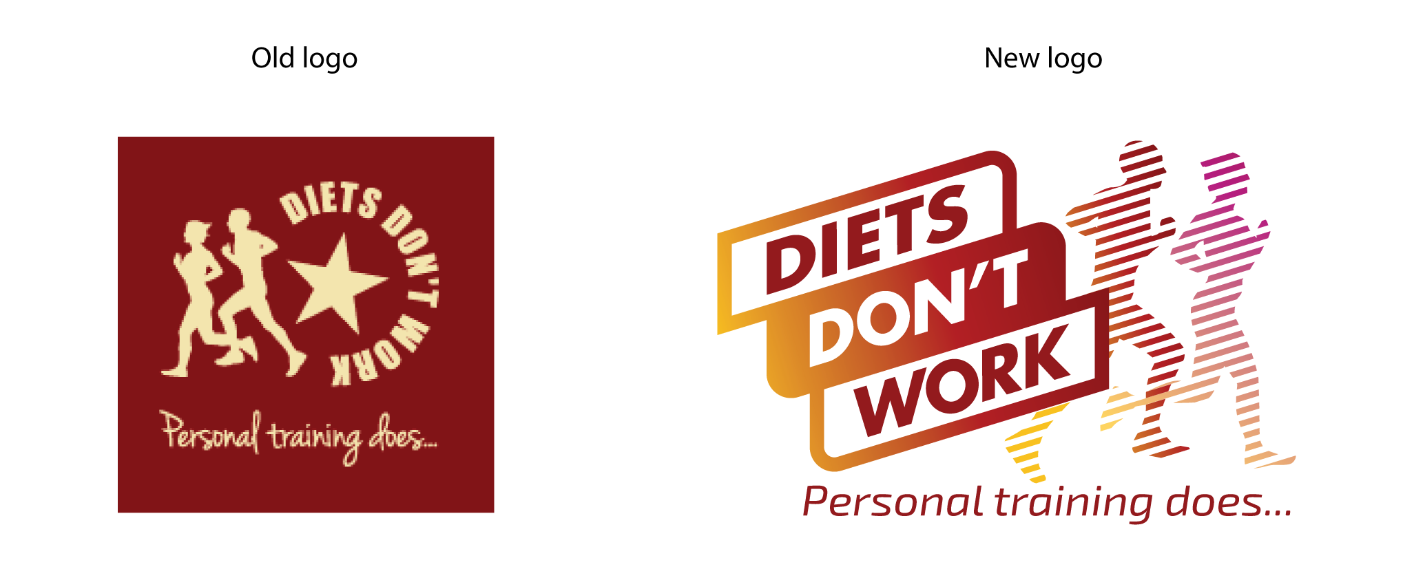
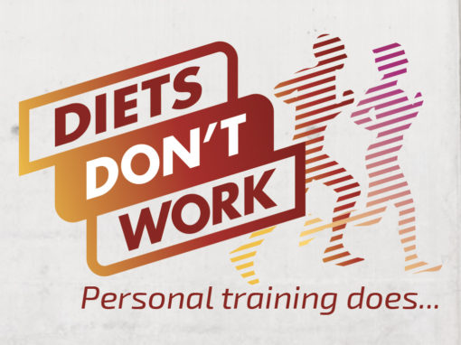
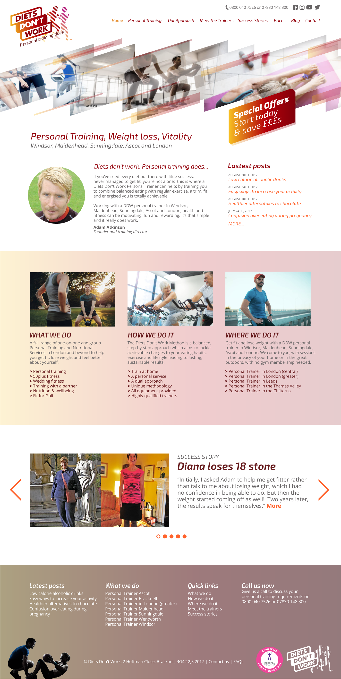
Diet’s Don’t Work is a personal training provider based in the south-east of England. Web is a key channel for generating new business, via search engine optimization and enquiries from organic search results.
I designed a new visual identity for Diets Don’t Work, providing a fresher and more contemporary fitness-oriented feel. The new website and logo maintain some continuity with the original brand by retaining the runners silhouette from the original logo and the burgundy and cream colours.
I gave the color palette a fresher feel by introducing some zingier accent colours to compliment the core brand colours. Switching the direction of the runners makes them feel like the are running forwards rather than backwards, since they follow the direction of the text. While the addition of diagonal stripes ties them into the logo text and provides a visual motif that can carry through the entire visual identity.
See more...